Finding the perfect tattoo isn’t just about choosing an image that looks good—it’s about finding words that carry weight, spark motivation, or capture a specific mindset. Text and quote tattoos offer a sleek, minimalist way to wear your personal philosophy right on your skin, serving as subtle daily reminders of strength, balance, and self-expression.
Whether you lean toward clean typography, elegant cursive, or architectural micro-fonts, lettered body art seamlessly bridges the gap between personal meaning and elevated style. From single-word mantras to timeless literary quotes, these fifteen quote and text tattoo ideas demonstrate how simple ink can make a bold statement.—let us jump straight into the ideas!
1. “Breathe” in Ultra-Fine Line Script
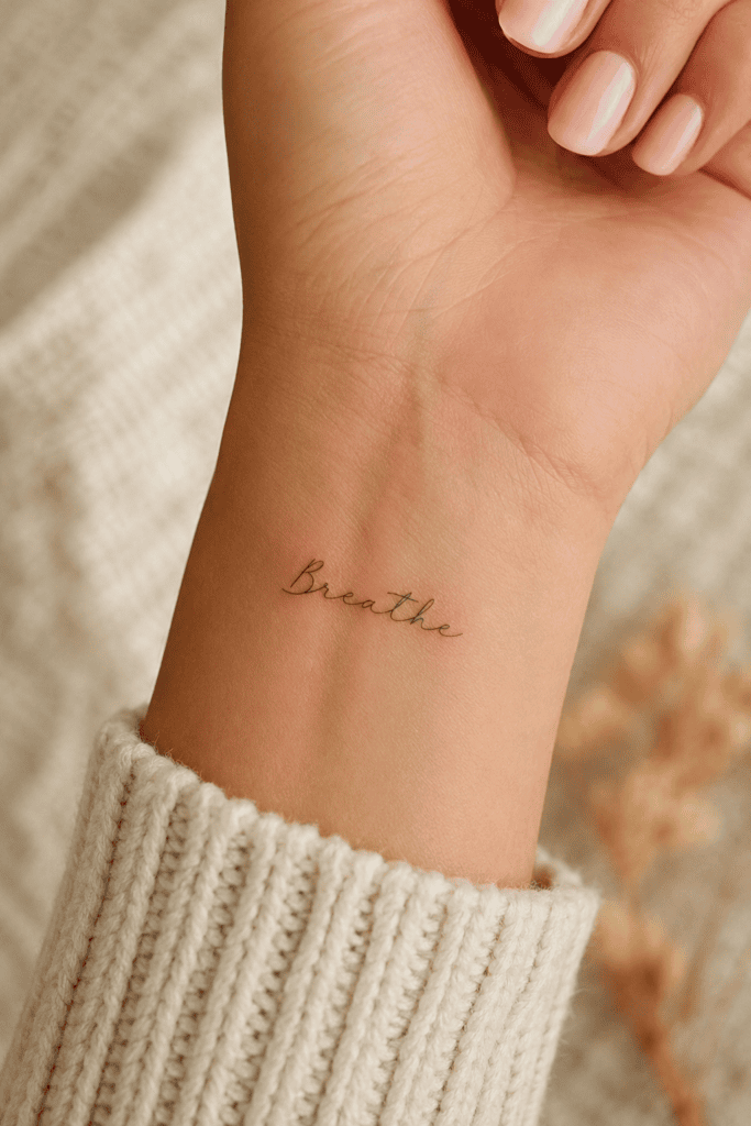
I got a tiny word etched right near my inner wrist during a wildly stressful month, and it remains the best impulsive decision I ever made. The word “Breathe” acts as an immediate physical anchor whenever daily chaos hits peak levels.
- Best Font Style: Delicate, continuous-line cursive script.
- Ideal Placement: Inner wrist, side of the index finger, or just above the elbow crease.
- Why It Works: It offers a constant visual reminder to slow down, and the micro-placement lets you glance at it privately without feeling loud.
Do you ever catch yourself holding your breath while staring at an overwhelming inbox or tackling a chaotic wardrobe purge? A delicate script word on your wrist brings you back to reality instantly. Pair this placement with stacked gold rings and a rolled-up blazer sleeve for an effortless, street-style aesthetic.
2. “Grace” in Classic Serif
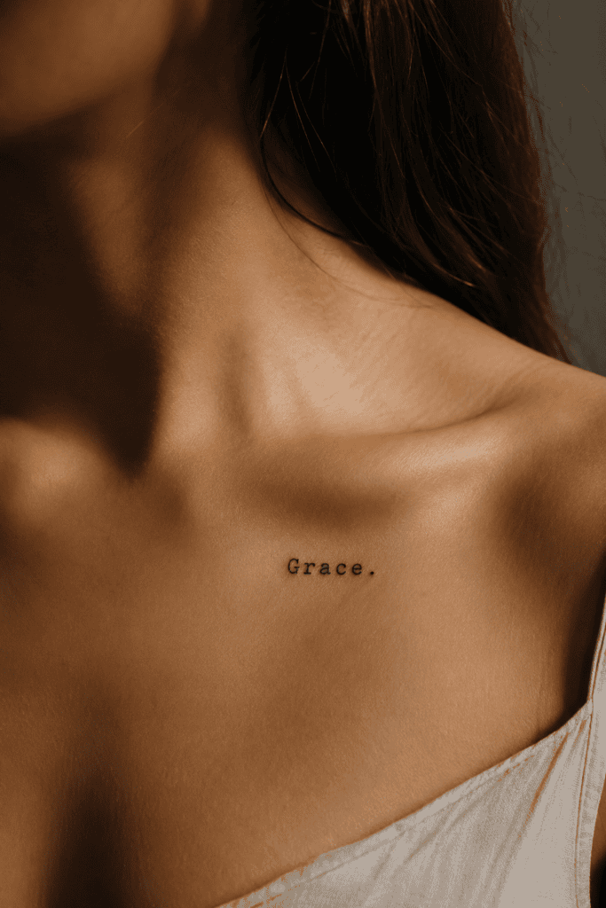
Serif fonts bring an editorial, literary vibe that elevates simple words into high-fashion statements. The word “Grace” feels grounded, timeless, and deeply sophisticated.
- Best Font Style: Bookish typewriter font or classic Times-style serif.
- Ideal Placement: Directly below the collarbone, along the ribcage, or on the inner bicep.
- Why It Works: It balances soft emotional weight with structured, razor-sharp typographical design.
I remember watching a friend pull her hair up into a messy topknot, revealing this exact tattoo tucked right behind her shoulder blade. The contrast between her casual silk slip dress and the sharp serif lettering looked so stunning that I immediately wrote the idea down in my notes app.
3. “Evolve” in Modern All-Caps
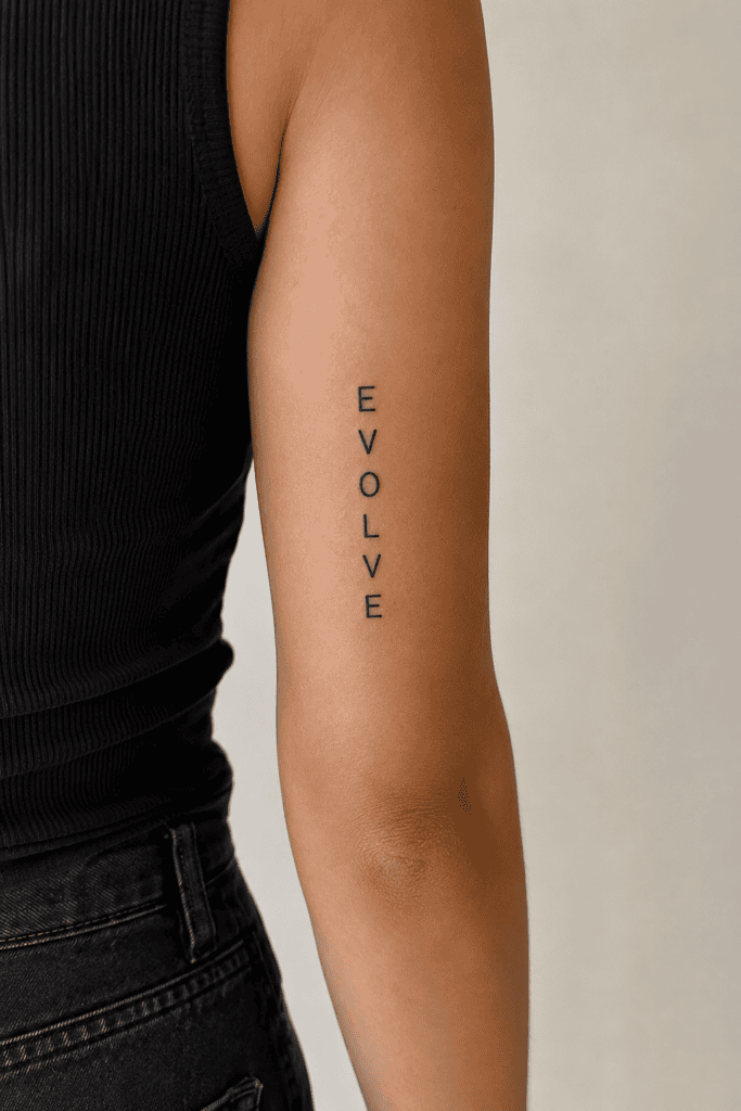
If you prefer clean geometry over flowing cursive, an all-caps approach delivers a sleek, contemporary edge. “Evolve” reminds you that changing your mind, your style, and your life path marks genuine progress.
- Best Font Style: Spaced-out, minimalist sans-serif capitals.
- Ideal Placement: Vertical line along the spine or centered on the back of the tricep.
- Why It Works: Bold capital letters create a clean visual line that pairs effortlessly with tailored trousers and modern blazers.
Who wants to stay stuck in the exact same mindset year after year? Spacing out capital letters gives the ink an architectural quality, turning a simple word into a piece of modern graphic art on your skin.
4. “Still I Rise” in Handwritten Cursive
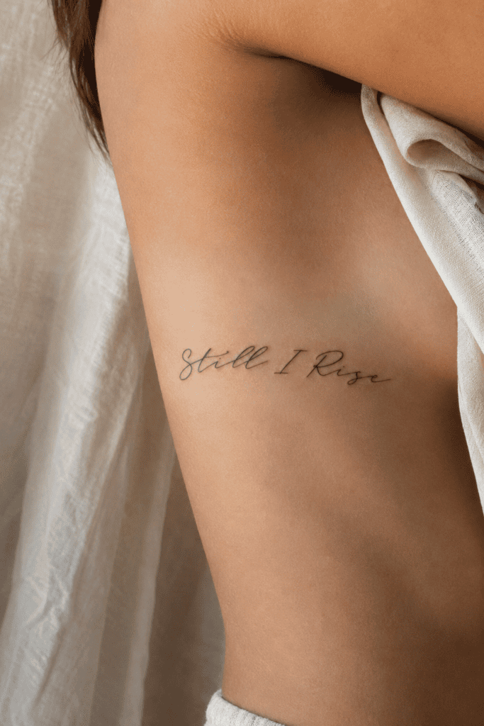
Maya Angelou gave us these iconic words, and they remain one of the most powerful mantras you can wear. I love seeing this phrase placed somewhere you only notice when you catch your reflection in a mirror.
- Best Font Style: Soft, handwritten cursive that feels organic and personal.
- Ideal Placement: Running down the side of the ribcage or along the inner forearm.
- Why It Works: It carries profound personal strength while maintaining an elegant, quiet presence.
Think about how many times you rebuilt your confidence after a tough breakup, a career pivot, or a major life hurdle. Placing this phrase along your ribcage keeps the message close to your heart, serving as your private armor on difficult days.
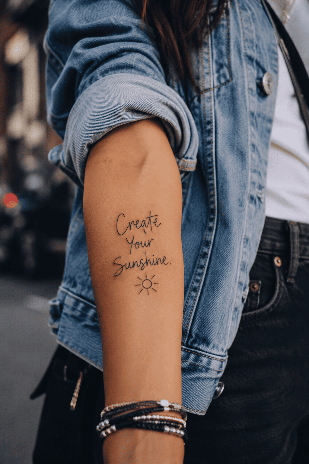
5. “Create Your Sunshine” in Playful Freehand

Ever feel like the weather, your commute, and your morning coffee are all plotting against your mood? This phrase reminds you that you control your internal environment regardless of external chaos.
- Best Font Style: Playful, slightly imperfect freehand lettering.
- Ideal Placement: Outer forearm, collarbone, or just above the outer ankle.
- Why It Works: The sunny optimism contrasts brilliantly with edgy streetwear pieces like oversized denim jackets and chunky boots.
I saw a girl wearing this design on her outer forearm paired with a leather jacket and an oversized vintage tee. The playful freehand font took away any potential corny vibes and made the entire quote look cool, intentional, and stylish.
6. “Amor Fati” in Architectural Micro-Caps
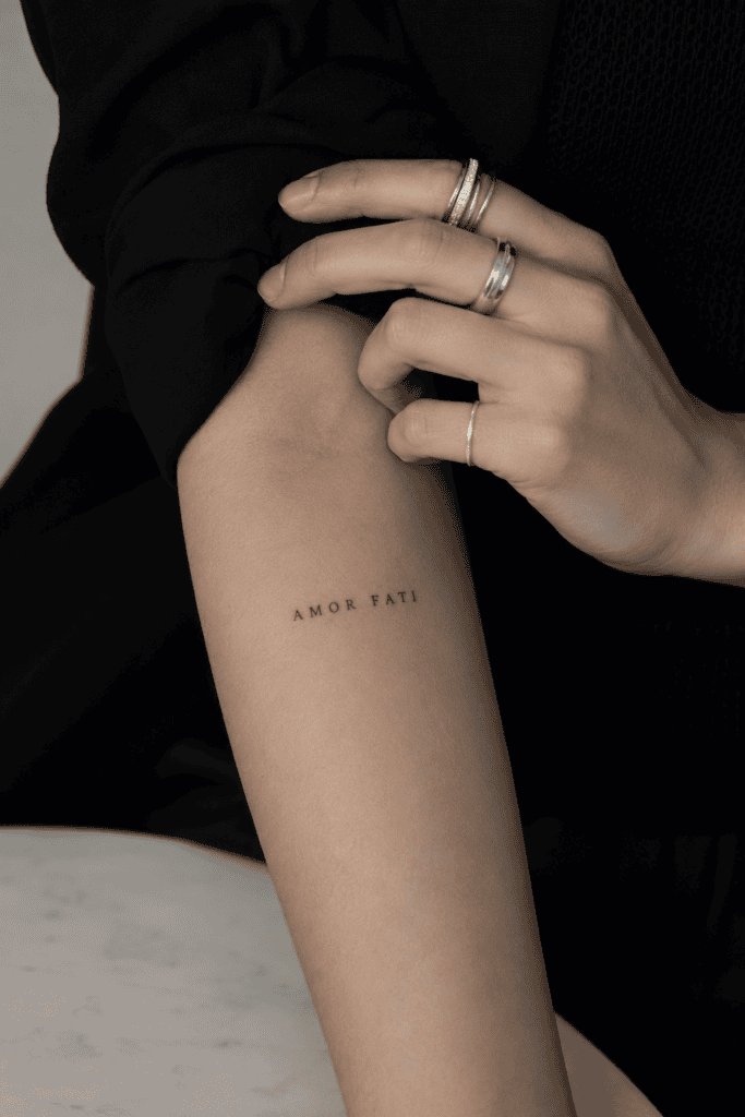
Philosophers have leaned on this Latin phrase—meaning “love of fate”—for centuries, but it looks remarkably chic rendered in tiny ink. “Amor Fati” pushes you to accept every outcome, good or bad, as an essential part of your journey.
- Best Font Style: Tiny, razor-sharp micro-capitals.
- Ideal Placement: Inner forearm, right where you see it while typing on your keyboard.
- Why It Works: Ancient wisdom meets modern editorial style, making it a brilliant conversation starter.
TBH, learning to embrace life’s unexpected twists saves you so much energy compared to fighting reality! Rendering this short phrase in microscopic, architectural lettering turns deep philosophy into a subtle, high-fashion accessory.
7. “C’est la vie” in Slanted Parisian Script
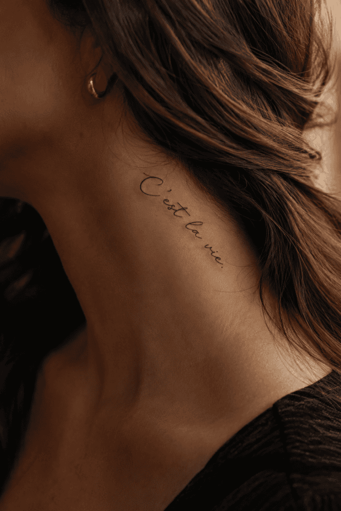
Nothing beats authentic French script for sheer visual charm and effortless cool. “C’est la vie” reminds you to shrug off small mishaps, spilled matcha, or wardrobe malfunctions with classic European composure.
- Best Font Style: Slanted, fluid Parisian cursive.
- Ideal Placement: Side ribcage, hip line, or the back of the neck.
- Why It Works: It carries an easygoing attitude that instantly makes any casual outfit feel a little cooler.
Did your favorite white linen top pick up an accidental coffee stain five minutes before an important meeting? Shrug it off, roll up your sleeves, and let your French-script tattoo do the talking!
8. “Ad Astra” in Minimalist Serif
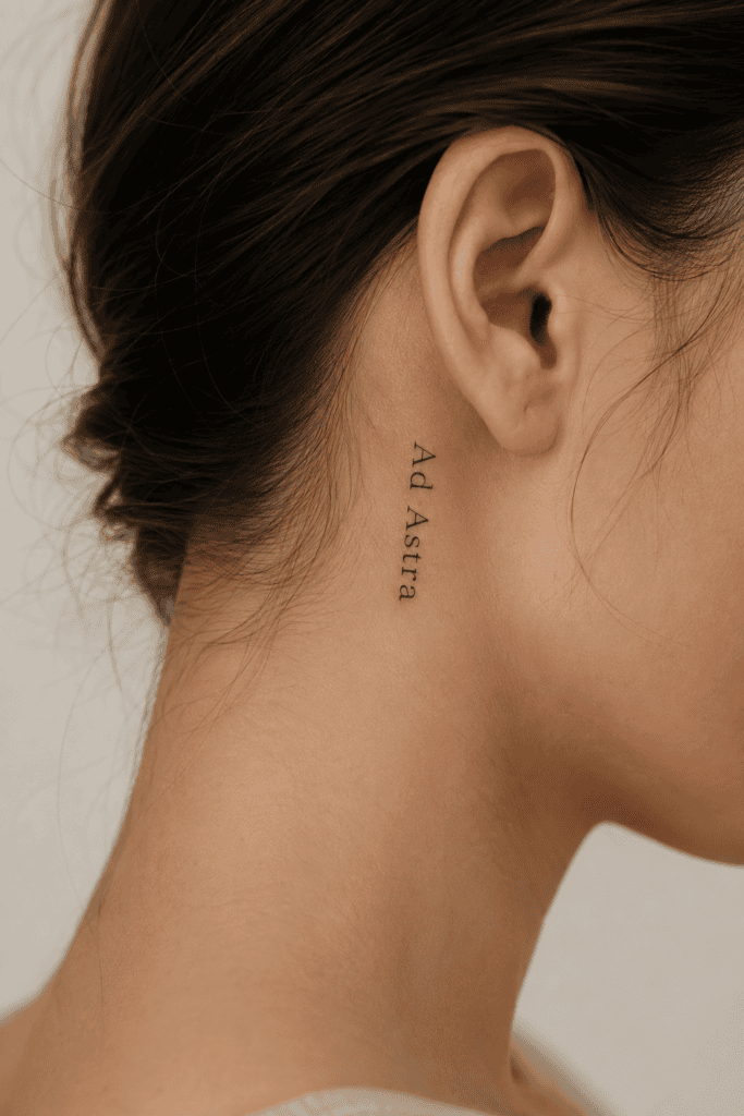
Short for Ad astra per aspera (“Through hardships to the stars”), this Latin snippet keeps the deep meaning while saving valuable skin real estate. It looks crisp, sharp, and entirely intentional.
- Best Font Style: Fine-line book serif or clean block capitals.
- Ideal Placement: Behind the ear, side of the wrist, or inner ankle.
- Why It Works: The ancient root gives it classic weight, while the two-word length keeps the aesthetic quiet.
I love tattoos that feel like hidden secrets rather than loud proclamations. Tucking “Ad Astra” right behind your ear means people only spot it when you wear your hair in a sleek low bun or sweep it over one shoulder.
9. “Dolce Far Niente” in Romantic Cursive
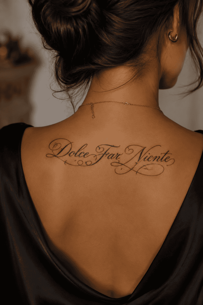
This famous Italian phrase translates to “the sweetness of doing nothing.” In a culture obsessed with non-stop hustle, wearing a reminder to sit back and savor a quiet moment feels like an act of rebellion.
- Best Font Style: Flowing, romantic hand-lettering with soft curves.
- Ideal Placement: Upper back, just below the neckline of a low-back dress.
- Why It Works: It celebrates rest and leisure, framing downtime as a vital art form rather than wasted time.
Picture yourself sitting at an open-air café in Florence with a glass of wine, wearing a backless summer dress that reveals this delicate cursive tattoo. It instantly evokes warmth, relaxation, and timeless European style.
10. “Wild and Free” in Loose Botanical Script
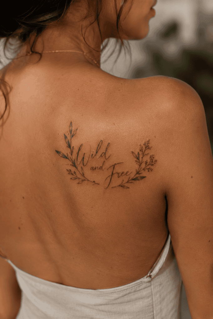
Inspired by Mary Oliver’s famous invitation to embrace your “one wild and precious life,” this text snippet focuses entirely on personal freedom and adventurous spirit.
- Best Font Style: Loose, organic script featuring subtle botanical flourishes.
- Ideal Placement: Across the shoulder blade or wrapped gently around the forearm.
- Why It Works: It resonates with travelers and free thinkers who want their style to reflect their unrestricted lifestyle.
Have you ever taken an unplanned road trip or made a bold career leap that completely changed your life for the better? This phrase celebrates those untamed, brave choices that define your personal story.
11. “I Am the Master of My Fate” in Bold Typewriter Print
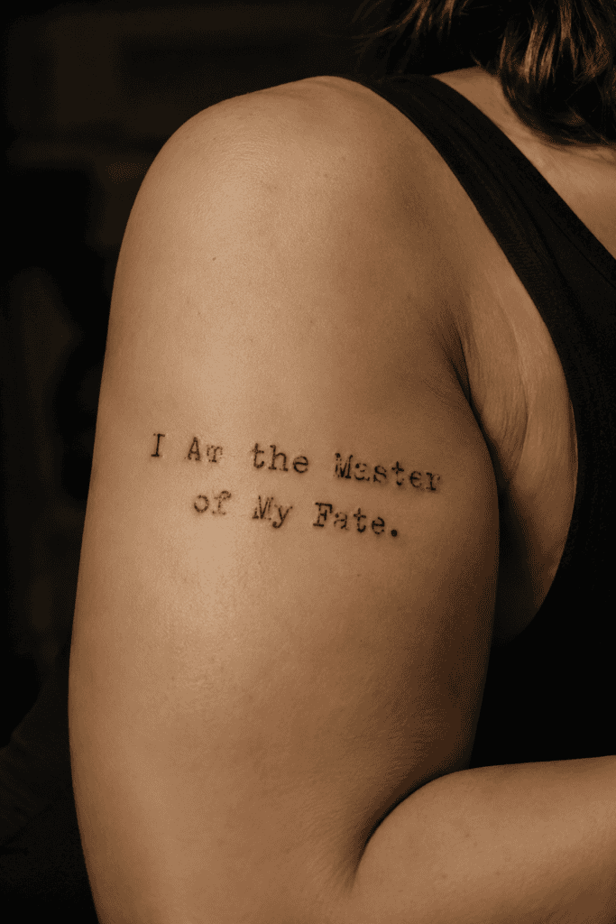
Taken from William Ernest Henley’s poem Invictus, this line packs intense empowerment into a few striking words. I saw this wrapped neatly around a woman’s upper arm last summer, and the look was so striking I stopped in my tracks.
- Best Font Style: Bold typewriter print with crisp, ink-stamped details.
- Ideal Placement: Wrapping around the upper bicep or along the outer forearm.
- Why It Works: It makes a confident declaration of independence that anchors tailored, sharp wardrobe pieces.
Pairing strong literary text with a vintage typewriter font gives your ink an authentic, old-school journalism feel. It tells the world that you hold the pen to your own life story.
12. “No Rain, No Flowers” with Fine-Line Accents
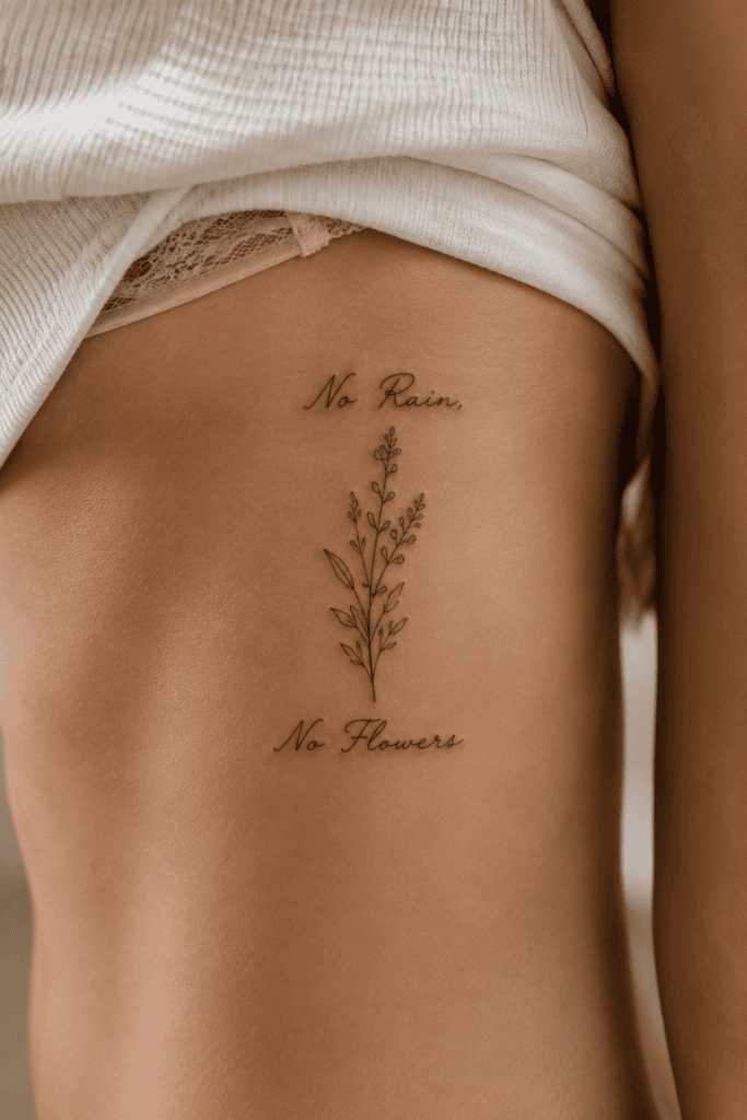
This poetic idiom bridges the gap between text design and delicate line art. It reminds us that difficult seasons produce our sweetest moments of personal growth and creative breakthrough.
- Best Font Style: Soft cursive paired with a single micro-stem floral accent.
- Ideal Placement: Ribcage, upper hip, or inner calf.
- Why It Works: Combining minimal text with small illustrative accents creates visual depth while keeping the design subtle.
I love how the small floral stem grounds the written words without making the tattoo feel crowded. It adds just enough artistic flair while keeping the phrase easy to read at a quick glance.
13. “She Believed She Could” in Micro-Lettering
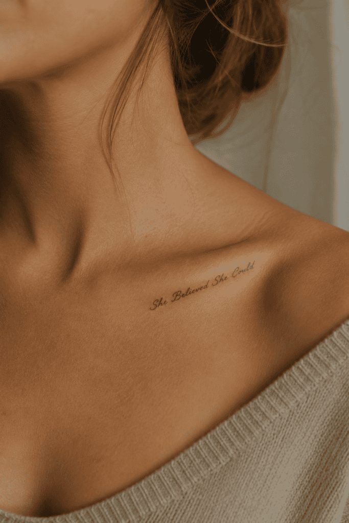
We have all seen this phrase on journal covers and motivational posters, but executing it in a custom micro-script gives it fresh, high-fashion energy. IMO, the core message never loses its punch.
- Best Font Style: Ultra-custom micro-script with high contrast and tight precision.
- Ideal Placement: Inner bicep or contoured right along the collarbone.
- Why It Works: It acts as a personal badge of honor for obstacles you have already conquered behind closed doors.
When you place micro-lettering along the inner bicep, the tattoo stays completely hidden until you reach up or pull back your jacket sleeve. That subtle element of surprise makes the ink feel far more personal.
14. “Be Here Now” in Clean Sans-Serif
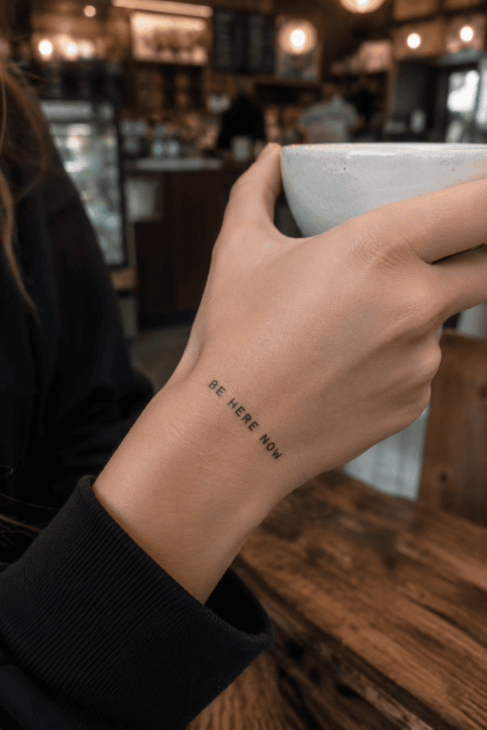
Mindfulness trends come and go, but Ram Dass’s classic three-word reminder never ages out of style. It pulls you straight out of anxious future-planning and plants you firmly back in the present moment.
- Best Font Style: Clean, architectural sans-serif or typewriter print.
- Ideal Placement: Top of the wrist, side of the hand, or inner forearm.
- Why It Works: You notice it every single time you check your watch or type on your phone, gently pulling you back into the room.
How often do you catch your mind racing three steps ahead while you should be enjoying dinner with friends? Glancing down at your wrist and seeing clean, direct block lettering instantly resets your focus.
15. “Trust the Process” in Modern Italic
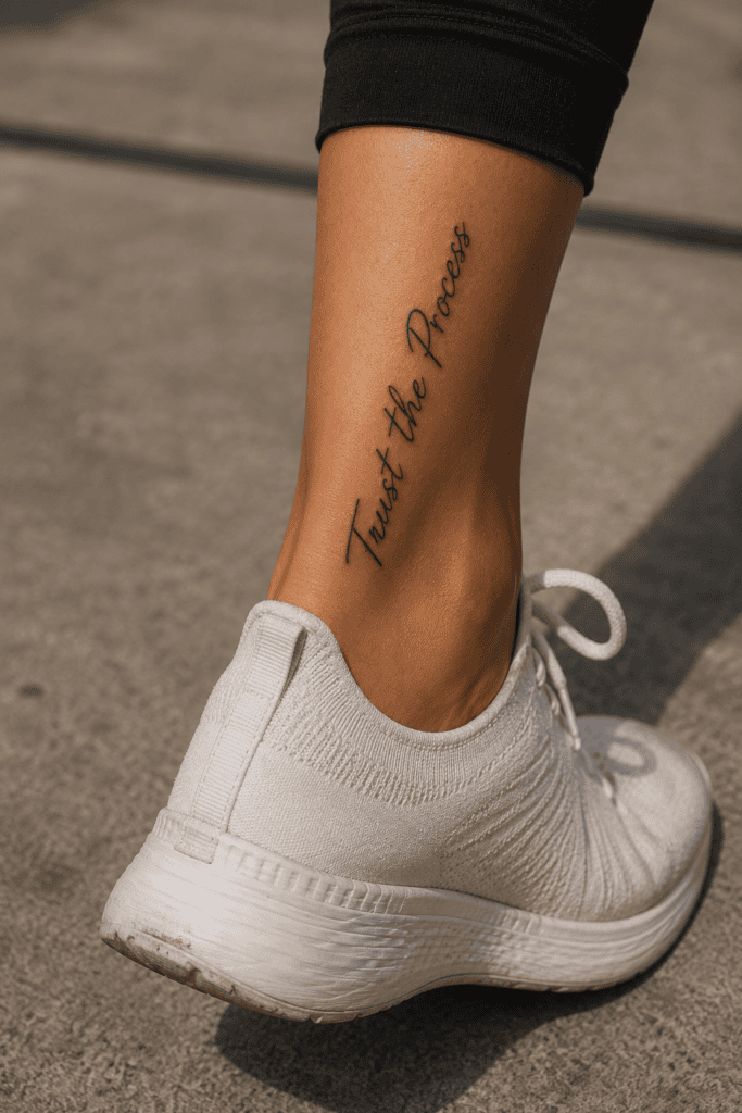
We live in an instant-gratification world where waiting for results feels incredibly frustrating. This short reminder keeps you grounded when your long-term goals seem far out of reach.
- Best Font Style: Slanted modern italic or clean, spaced block print.
- Ideal Placement: Along the ankle bone, lower calf, or side rib.
- Why It Works: It applies to everything from launching a new business and healing your heart to waiting for an awkward haircut to grow out 🙂
┌────────────────────────────────────────────────────────────────────────┐
│                        QUICK PLACEMENT CHEAT SHEET                     │
├─────────────────┬──────────────────────────┬───────────────────────────┤
│ Body Location   │ Best Font Match          │ Visibility Level          │
├─────────────────┼──────────────────────────┼───────────────────────────┤
│ Inner Wrist     │ Fine-line Cursive        │ High (Everyday view)      │
│ Collarbone      │ Classic Serif            │ Medium (Outfit dependent) │
│ Spine / Tricep  │ Modern All-Caps          │ Low/High (Dramatic reveal)│
│ Inner Bicep     │ Micro-Script             │ Low (Private mantra)      │
└─────────────────┴──────────────────────────┴───────────────────────────┘
Essential Rules for Choosing Your Font and Placement
Picking your phrase is only half the fun. Choosing the wrong font or bad placement can turn a brilliant idea into a blurry design you end up hiding under long sleeves.
Matching Fonts to Your Personal Style
Your typography selection completely alters the mood of your ink:
- Fine-Line Cursive: Feels soft, romantic, and intimate. Perfect for hidden placements and gentle reminders.
- Bookish Serif: Brings an intellectual, editorial vibe. Looks incredible on forearms, triceps, and across shoulder blades.
- Minimalist Sans-Serif: Delivers a graphic, streetwear-inspired edge. Works best with short, punchy words and all-caps mantras.
Body Placement Hacks You Should Never Ignore
Body movement alters how straight lines of text look throughout the day. Keep these crucial practical tips in mind before your artist places the paper stencil:
- Watch for Flex Zones: Wrists, elbows, and ankles twist constantly. Test your stencil in both relaxed and flexed positions to prevent awkward curving.
- Plan for Aging Ink: Ink spreads slightly under the skin over time. Ensure your artist spaces tight letters adequately so your quote stays readable years down the road.
- Control Your View: Decide whether you want the text oriented toward you as a private reminder or facing outward for the world to read.
Simple Aftercare Routine to Keep Your Text Crisp
Fine-line text tattoos require gentle care during the first few weeks of recovery to keep every letter sharp and clean.
- Avoid Over-Moisturizing: Thick coats of heavy ointment trap heat and pull ink out of delicate fine lines. Apply a paper-thin layer of fragrance-free lotion twice daily instead.
- Protect It From Sun Exposure: UV rays destroy crisp black lines faster than anything else. Keep fresh ink covered outdoors, and apply SPF 50 religiously once the skin heals completely.
- Never Pick Small Scabs: Text tattoos form tiny line-scabs while healing. Picking them pulls ink directly out of the skin, leaving awkward blank gaps in your phrase.
Wear Your Story With Confidence
Tattoos are not just permanent marks on skin; they represent dynamic extensions of your personal style. Whether you choose a delicate single word on your wrist or a bold Latin phrase along your forearm, pick words that resonate with your true self today and inspire where you are going tomorrow.
Do you have a favorite quote saved in your phone notes right now? Book that shop consultation, double-check your spelling, and rock your new ink with total confidence!