
I’ll never forget standing in my empty spare room at 35 weeks pregnant, panic-stricken at the bare walls and wondering how on earth I was going to turn this space into a nursery that didn’t look like a generic baby store exploded. My husband kept saying, “Just pick blue stuff,” but I wanted something more… intentional? Personal? Not awful to look at for the next few years?
Fast-forward through three nurseries (yes, three – we moved twice), countless Pinterest saves, and more late-night Amazon cart additions than I care to admit, and I’ve learned a thing or two about creating boy nurseries that actually function AND look good. Here’s what really works, what doesn’t, and the ideas I wish someone had shared with me from the start.
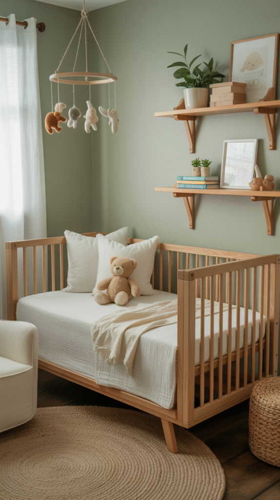
The “Not-So-Blue” Approach That Changed Everything
My biggest revelation? You don’t need a single blue item to create a gorgeous boy nursery. I discovered this accidentally when I fell in love with a sage green paint color (Sherwin Williams’ Clary Sage, if you’re curious) and decided to just go with it. Added some warm wood tones, cream accents, and suddenly had the most calming, sophisticated space that felt way more “us” than any navy-and-gray combo I’d been obsessing over.
What made it work: Earthy greens, warm grays, and natural textures create this cozy, gender-neutral vibe that grows with your kid. My son’s almost four now and still loves his “forest room.”
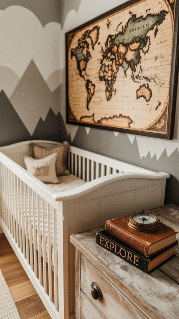
Adventure Awaits (But Make It Subtle)
The whole “adventure theme” thing can go really wrong really fast – trust me, I’ve seen the nurseries that look like REI threw up in them. But when you do it right? Chef’s kiss.
I created an adventure-inspired space using a large vintage-style world map as wall art, some simple mountain silhouettes I painted freehand (they’re wonky and perfect), and a few carefully chosen pieces like a small vintage compass and some old books. The key was keeping it sophisticated enough that I didn’t cringe walking in there.
Pro tip: Skip the themed bedding and let your wall art do the talking. Solid colors for all the soft goods keep things from looking too busy.
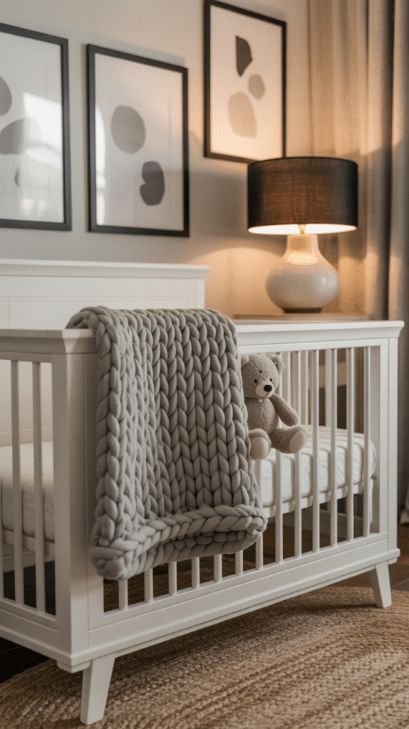
Monochrome Magic I Didn’t See Coming
Okay, this one surprised me. After my colorful first nursery, I went completely monochrome for baby #2 – just blacks, whites, and grays. Sounds boring, right? Wrong. It ended up being the most sophisticated, calming space, and here’s the kicker: it photographed beautifully for all those newborn photos.
The secret sauce was texture. Chunky knit blankets, a jute rug, smooth ceramic lamp bases, and matte black picture frames created so much visual interest without any color at all. Plus, every single thing I added later (toys, clothes, books) popped against that neutral backdrop.
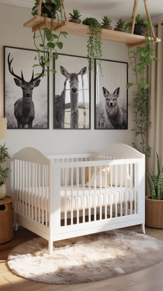
Woodland Creatures (Done Right)
I was hesitant about the woodland theme because it felt overdone, but then I found this approach that actually worked: instead of cartoon animals everywhere, I used realistic, vintage-inspired forest animal prints and mixed them with live plants and natural wood elements.
The game-changer was finding prints from actual nature photographers rather than cutesy illustrated ones. Mounted three black-and-white photos of a deer, owl, and fox in simple black frames, added some hanging plants (pothos are impossible to kill, just saying), and boom – woodland vibes without the cheese factor.
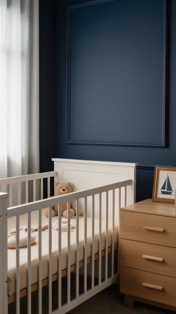
Navy and Gold (But Not How You Think)
Every boy nursery seems to go navy and gold, but most do it wrong. Instead of buying a bunch of navy furniture and gold accessories, I painted one accent wall in deep navy (Benjamin Moore’s Hale Navy) and kept everything else white and natural wood. Then added just tiny pops of brass through cabinet hardware, a small lamp, and picture frames.
The result felt rich and sophisticated instead of like a nautical theme store. The trick is restraint – let the navy be the star and use gold super sparingly.
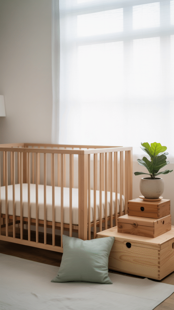
Minimalist Approach That Actually Works With Babies
Minimalism with a baby sounds impossible, but hear me out. I’m not talking about empty rooms – I’m talking about intentional choices. Choose a simple color palette (I did white, natural wood, and one accent color), invest in beautiful storage that doubles as decor, and keep surfaces mostly clear.
This approach saved my sanity during those early months when everything felt chaotic. Having a calm, uncluttered space to retreat to was honestly therapeutic. Plus, it made cleaning up toys later much easier because everything had a designated spot.
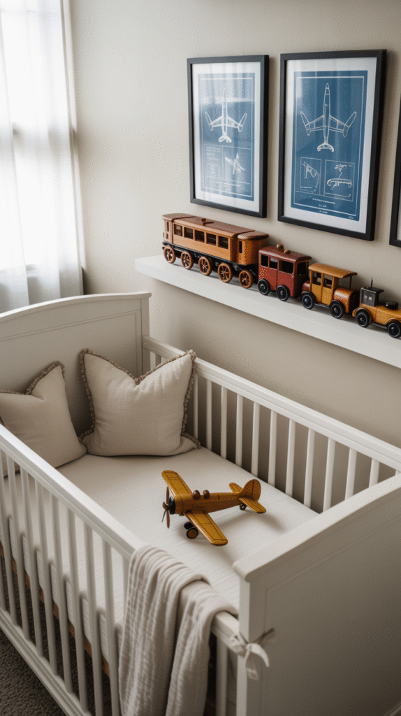
Transportation Themes That Don’t Scream “Little Boy”
Cars, trucks, planes – they don’t have to look juvenile. I created a transportation-inspired nursery using vintage travel posters, a really beautiful wooden toy train as shelf decor, and some antique-looking toy cars displayed like art pieces.
The key was treating transportation elements like sophisticated collectibles rather than kiddie toys. Found some gorgeous vintage airplane blueprints on Etsy, framed them properly, and suddenly had “transportation art” instead of “little boy decorations.”
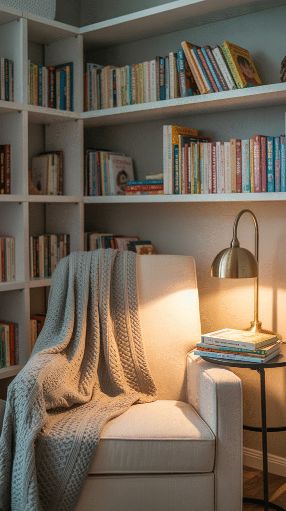
Bookish and Brilliant
This might be my favorite approach. I created a literary-themed nursery with built-in shelves (okay, IKEA Billy bookcases painted to match the walls), vintage children’s books displayed cover-out, and a cozy reading corner with a really good nursing chair.
Started collecting beautiful children’s books from thrift stores and used book sales months before he was born. The room felt sophisticated and grown-up but also whimsical and story-filled. Plus, it encouraged the reading habit from day one.
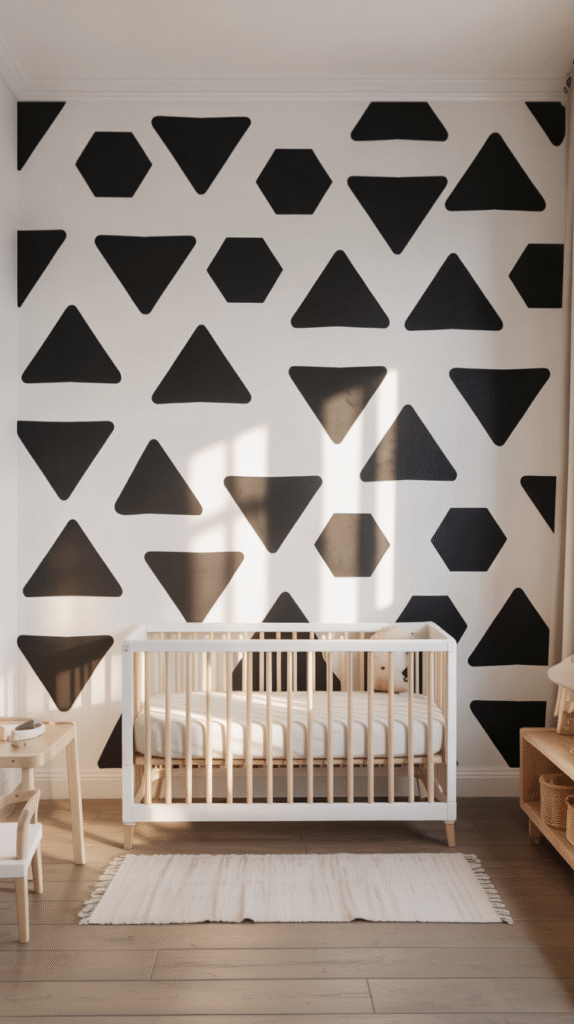
The Black and White Statement Wall
Sometimes one dramatic element is all you need. I painted geometric shapes on one wall in black and white – just simple triangles and hexagons in a random pattern. Took me a weekend, cost about $30 in paint, and became the most photographed wall in our house.
Things I learned the hard way: Use painter’s tape that’s actually made for delicate surfaces (the blue stuff can pull off fresh paint), and don’t rush the taping process. Those crisp lines make all the difference.
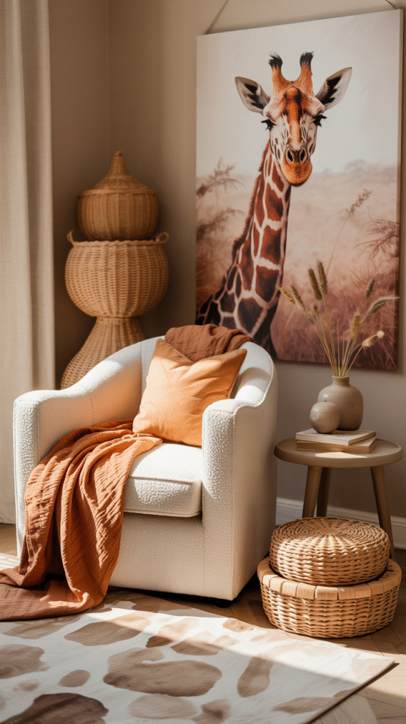
Safari (Without the Overwhelming Animal Print)
Safari themes can go really wrong really fast, but I found a way to make it work. Instead of animal prints everywhere, I used a neutral color palette inspired by African sunsets – warm terracottas, creams, and dusty oranges. Added one large, beautiful giraffe print and some woven baskets for storage.
The vibe was warm and global-inspired without being theme-y. The woven textures and earthy colors created this really calming, organic feeling that felt more “worldly sophisticate” than “jungle nursery.”
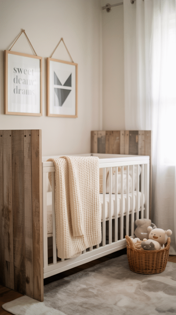
Rustic Modern (The Best of Both Worlds)
This combination shouldn’t work but totally does. I mixed reclaimed wood elements (found an amazing floating shelf from a local craftsman) with clean, modern furniture lines and simple geometric patterns.
The rustic wood brought warmth and character, while the modern elements kept things from feeling too farmhouse-y. Added some simple black and white prints and suddenly had this really balanced, interesting space that felt both cozy and current.
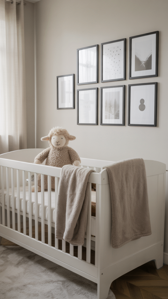
Growth-Minded Gallery Wall
Here’s what nobody tells you: that nursery you spend months perfecting? Your kid will have opinions about it by age two. So I created a gallery wall using frames that could easily swap out new art as his interests changed.
Started with simple black and white photos and some geometric prints, but designed it so I could easily switch to dinosaur art, space themes, or whatever he’d be into later. The frames stayed consistent, but the content could evolve. Genius move, if I do say so myself.
The Real Talk About What Actually Matters
After three nurseries and watching countless friends stress over every detail, here’s what I’ve learned really matters: good blackout curtains (seriously, invest in the expensive ones), a comfortable chair for YOU, and storage that actually works for your lifestyle.
The cute stuff is fun, but those practical elements will make or break your daily experience in that room. I spent way too much time agonizing over throw pillow colors and not nearly enough thinking about where I’d put all those tiny baby clothes.
Start with your must-haves, add personality through easily changeable elements like art and textiles, and remember that your baby honestly doesn’t care if the nursery matches Pinterest. They just want to be fed and snuggled – preferably in a room that doesn’t make you feel crazy every time you walk in.