So there I was last spring, staring at my boring beige kitchen cabinets for the thousandth time, when my neighbor knocked on the door. She’d just finished this gorgeous two-tone cabinet makeover – navy lowers, crisp white uppers – and I literally gasped when I walked into her kitchen. That was it. I was officially obsessed.
Fast forward six months, three color changes, and one minor emotional breakdown later, and I’ve learned everything there is to know about two-tone cabinets. The good, the bad, and the “why did I think chartreuse and burgundy would work together?”
If you’re thinking about jumping on the two-tone train, let me save you some headaches (and money) with these ten ideas that actually work in real life.
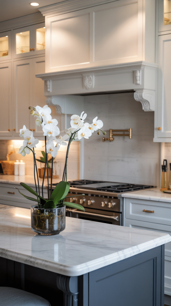
The Classic Navy and White Split
Let’s start with the combo that got me into this whole mess. Dark navy lowers with white uppers is basically the little black dress of kitchen design – it works everywhere, always looks put-together, and never goes out of style.
I painted my lower cabinets in Benjamin Moore’s Hale Navy (after testing literally eight different navy samples – trust me on this one). The key is making sure your navy has enough depth without being so dark it looks black under your kitchen lighting. I learned this the hard way when my first choice looked like a void in my north-facing kitchen.
Pro tip I wish I’d known: Paint your sample squares bigger than you think you need. Like, way bigger. A 2×2 inch square tells you nothing about how a color will feel when it’s covering half your kitchen.
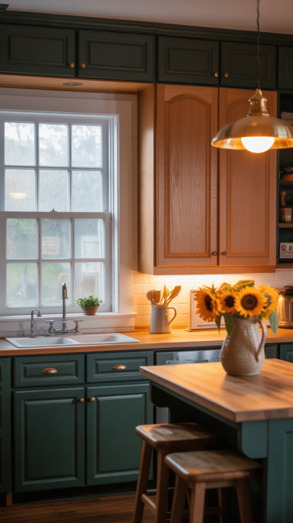
Forest Green Lowers with Natural Wood Uppers
This combo happened by accident when I was helping my sister renovate her 1960s ranch. We’d already committed to keeping the original wood uppers (gorgeous honey oak that just needed some love), and she wanted something dramatic below.
Forest green was perfect – it made those wood tones absolutely sing. We used Sherwin Williams’ Evergreens for the lowers, and the whole kitchen feels like a cozy cabin now. The trick is picking a green that has enough brown undertones to complement wood without clashing.
The timing was perfect too – we tackled this project in October when the fall light really brought out the warmth in both colors.
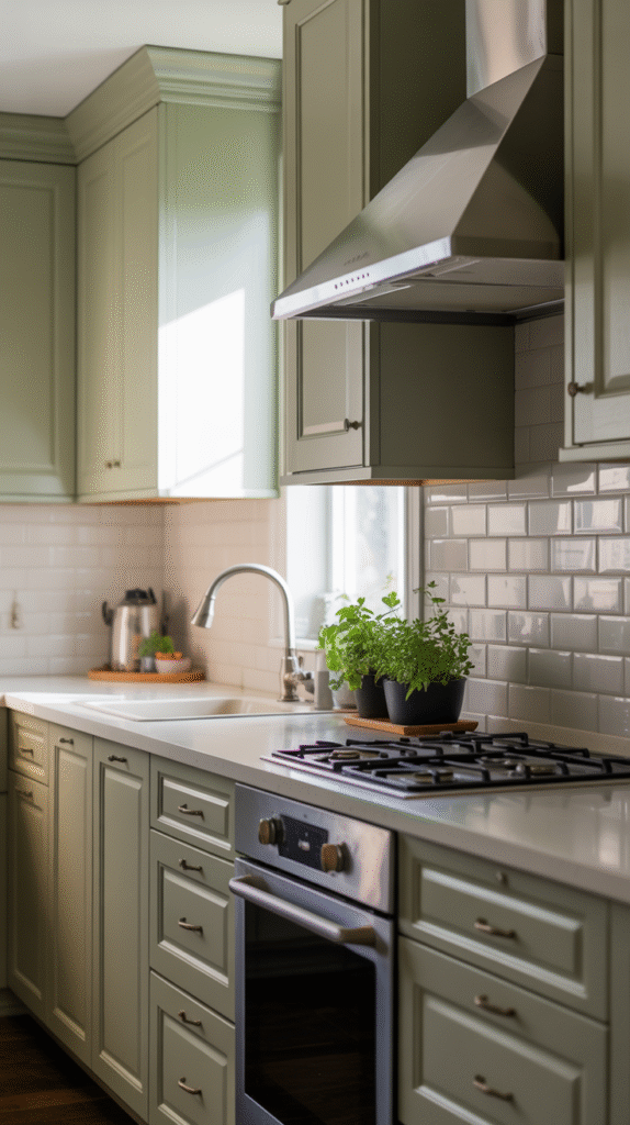
Soft Sage Uppers with Warm Gray Lowers
This one’s for my fellow commitment-phobes. When you can’t decide between cool and warm tones, this combo gives you both. I tried this in my friend’s galley kitchen last summer, and it completely transformed the space from cramped to serene.
We went with Clare’s Current Mood for the sage (it’s got just enough gray to keep it sophisticated) and paired it with Agreeable Gray below. The whole room feels bigger somehow – probably because neither color fights for attention.
Reality check: Sage can look muddy in low light, so if your kitchen doesn’t get great natural light, test it for at least a week before committing. I’ve seen this combo fail when people rushed the color selection.
Charcoal Lowers with Warm White Uppers
This is my go-to recommendation for people who want drama but still want to sell their house someday. Charcoal is sophisticated without being too trendy, and it hides everyday wear better than lighter colors (ask me how I know).
I used Benjamin Moore’s Wrought Iron for a client’s kitchen remodel, paired with Cloud White uppers. The contrast is stunning, and three years later, those lower cabinets still look freshly painted despite two kids and a very food-motivated golden retriever.
Things I wish I’d known: Charcoal shows dust and fingerprints more than you’d expect. A good quality semi-gloss paint is non-negotiable here. Don’t cheap out – I learned this lesson with a budget paint that looked chalky within six months.
Cream Lowers with Soft Blue-Gray Uppers
This combo is having a moment, and honestly, I get it. It’s like the grown-up version of blue and white – sophisticated but still fresh. I tried this in my own kitchen as a test run (yes, I change my kitchen colors way too often – occupational hazard).
The key is getting the undertones right. Your cream needs to have enough warmth to balance the cool blue-gray, or the whole thing looks disconnected. I used Benjamin Moore’s White Dove for the cream and Nimbus Gray for the blue-gray after testing probably fifteen combinations.
Natural Wood Lowers with Crisp White Uppers
Sometimes the best two-tone approach is letting natural wood be one of your “colors.” This works especially well if you’re working with existing wood cabinets that are in good shape but feel dated.
I helped my neighbor do this last fall – we kept her original oak lowers (just gave them a good cleaning and fresh hardware) and painted the uppers in Pure White. The transformation was incredible, and we saved a fortune by not painting everything.
Seasonal note: If you’re planning this combo, fall and winter are perfect for the wood restoration part. Lower humidity means better results when you’re cleaning and conditioning existing wood.
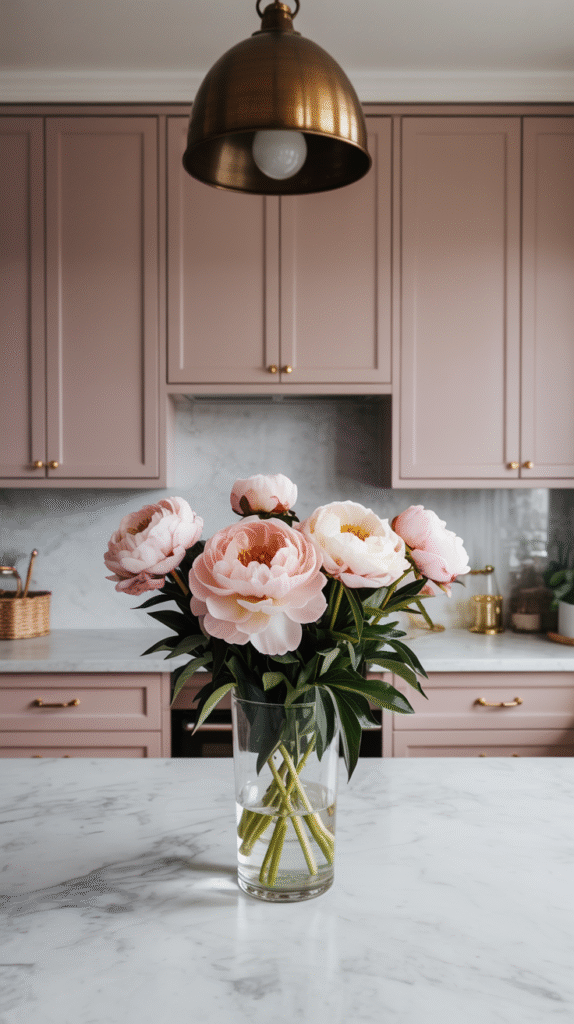
Dusty Pink Lowers with Warm Gray Uppers
Okay, hear me out on this one. I know pink kitchen cabinets sound scary, but when you go dusty and muted, it’s actually incredibly sophisticated. I tried this in my powder room first (less commitment) and loved it so much I convinced a client to try it in her kitchen.
We used Farrow & Ball’s Dead Salmon (terrible name, gorgeous color) for the lowers and Elephant’s Breath for the uppers. The whole kitchen feels like a warm hug, and it photographs beautifully – important if you’re planning to list your house eventually.
Reality check: This combo needs good lighting to work. In a dim kitchen, the pink can look muddy and the gray can feel cold.
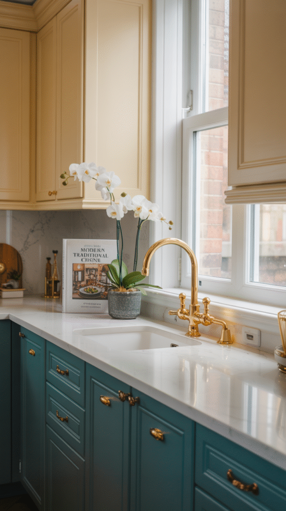
Deep Teal Lowers with Soft Cream Uppers
This is my current kitchen situation, and I’m obsessed. Deep teal feels rich and unexpected without being overwhelming, especially when you balance it with something soft and neutral up top.
I used Benjamin Moore’s Aegean Teal for the lowers and Moonlight for the uppers. The teal has enough green to feel fresh but enough blue to feel calming. It’s been six months, and I still get a little thrill every time I walk into my kitchen.
Pro tip: Teal can shift dramatically in different lights. What looks perfect in afternoon sun might look completely different under your morning coffee routine lighting. Test it through a full day cycle.
Warm Mushroom Lowers with Soft White Uppers
This is for the people who want something different but not too different. Mushroom brown is having a major moment right now, and paired with soft white, it creates this incredibly sophisticated, spa-like feeling.
I tried this combo in a client’s kitchen that gets beautiful morning light, and it’s perfection. We used Sherwin Williams’ Accessible Beige for the lowers (despite the name, it reads more mushroom than beige) and Alabaster for the uppers.
The whole space feels expensive and calming – like a high-end hotel kitchen where you’d actually want to cook.
Black Lowers with Natural Wood Uppers
This one’s not for the faint of heart, but when it works, it really works. I helped a friend do this in her modern farmhouse kitchen, and the contrast is absolutely stunning.
The key is getting the proportions right. In her kitchen, we have more upper cabinets than lower ones, so the wood dominates and the black just adds drama. If you have more lower cabinets, this combo might feel too heavy.
We used Benjamin Moore’s Black Beauty for the lowers and kept the existing white oak uppers natural with just a clear coat. The hardware makes a huge difference here – we went with brass to warm up the contrast.
Making It Work in Your Space
Here’s the thing I’ve learned after all these experiments: the best two-tone combination is the one that makes you smile when you walk into your kitchen. But there are some practical considerations that’ll save you from my mistakes.
Lighting is everything. I can’t stress this enough. Colors that look amazing in the paint store can look completely different in your kitchen. Always test samples in your actual space, and look at them at different times of day.
Consider your commitment level. Upper cabinets are harder to repaint than lower ones (trust me, I’ve done both multiple times). If you’re not sure about a bold color, put it on the bottom where it’s easier to change later.
Think about your hardware. The finish and style of your cabinet hardware can make or break a two-tone look. I’ve found that warm metals (brass, copper, bronze) work better with most color combinations than cool metals, but test it in your space.
Don’t forget about your walls. Your cabinet colors need to work with your wall color too. I learned this lesson when my perfect cabinet combo looked terrible with my existing backsplash.
The best part about two-tone cabinets? They make your kitchen feel custom and thoughtful without requiring a full renovation. Even if you’re just painting existing cabinets, you can completely transform your space.
Just promise me you’ll test your colors properly. Take it from someone who’s lived with more cabinet color combinations than anyone should – a little patience upfront saves a lot of regret later.